Purpose
Fundrise’s customer base has been growing exponentially, and with that growth has come higher volumes of customer support issues. They had some support-related resources on their marketing website, but it was time to develop a dedicated Help Center website, targeting authenticated users. The goal of this effort was to lay out a solid foundational hierarchy that could grow and expand with the user base with the hope of eventually incorporating dynamic and customized content.
Process
Project kickoff
Competitive analysis and conceptual directions
Task flows and information architecture
End to end wireframe experience
Usability testing: wireframes, IA, taxonomy, naming
Visual designs
Audience
Fundrise users
Investors trend younger, male, tech-savvy
Investors trend younger, male, tech-savvy
Techniques & Skills
Competitor and pattern research
Information architecture
Wireframing
UI design
Usability testing
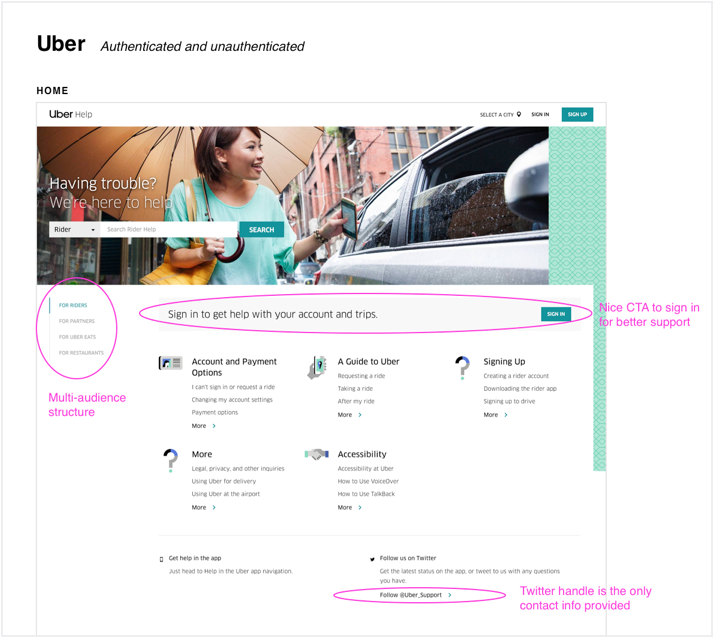
Competitive analysis
Annotated screenshots showing how other leading tech companies handle online support.
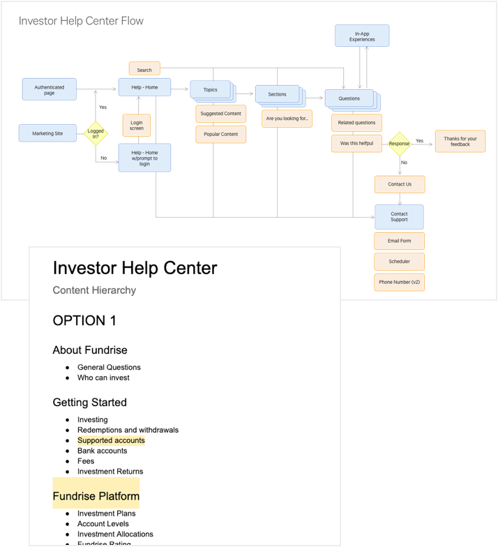
Task flows and IA
Since we were really trying to set up a solid foundation with this project, we drew out the user flow and information architecture first including taxonomy and naming.
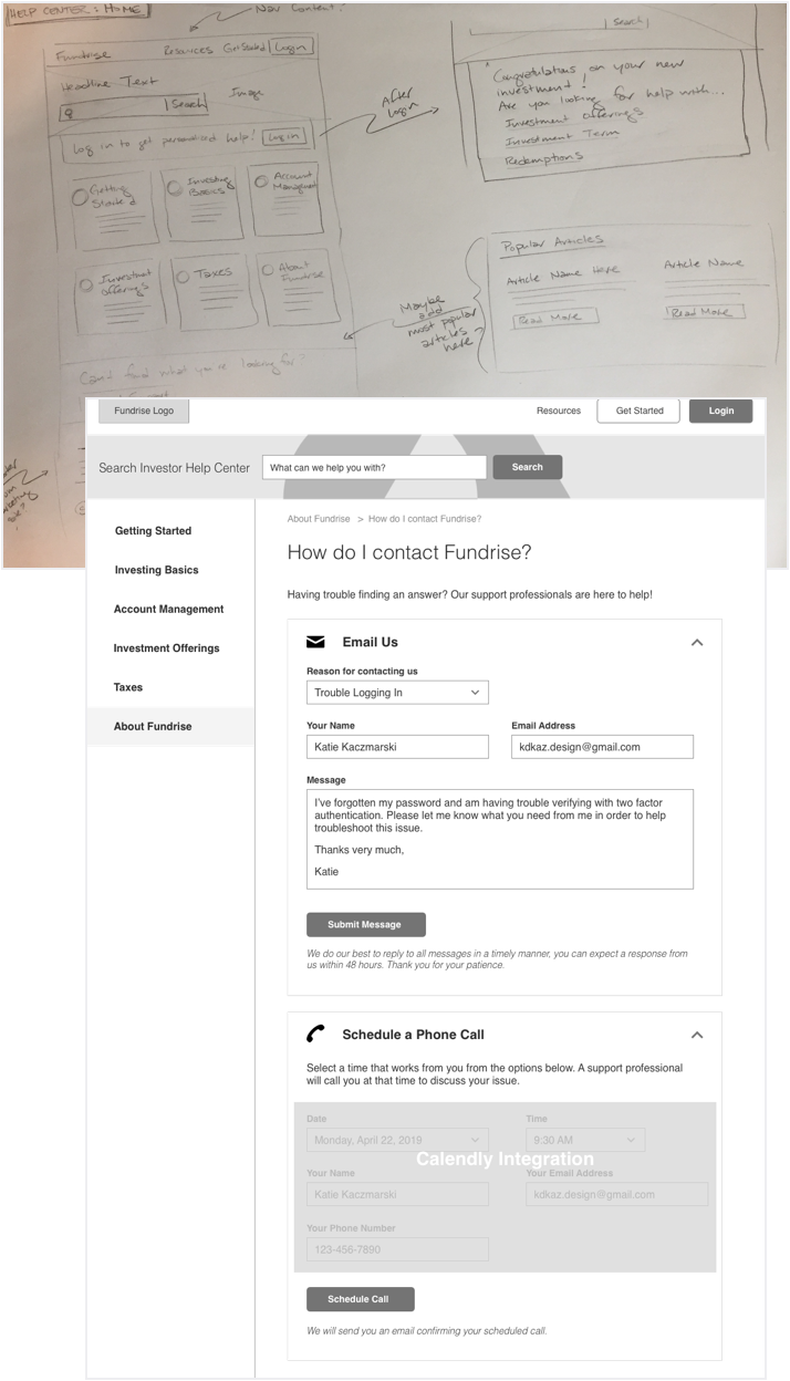
Sketches and Wireframes
I started with paper sketches to start bringing the user flow to life, incorporating noted ideas from the competitive analysis. After client review, we moved on to wireframes to further flesh out functionality and layout.
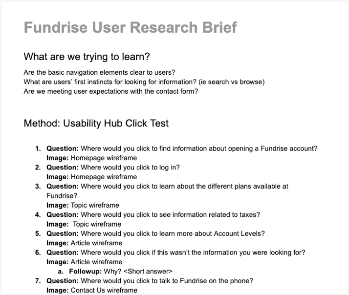
Usability testing
Provided the client with 3 options for deriving user insights during the wireframe stage. Decided on an approach, conducted the testing, analyzed and reported out the results.
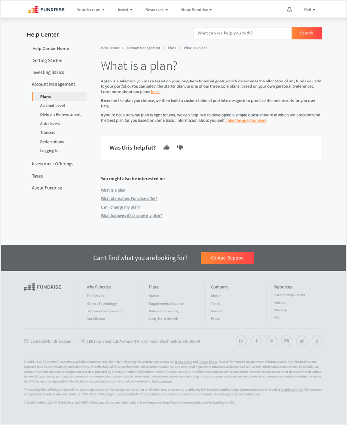
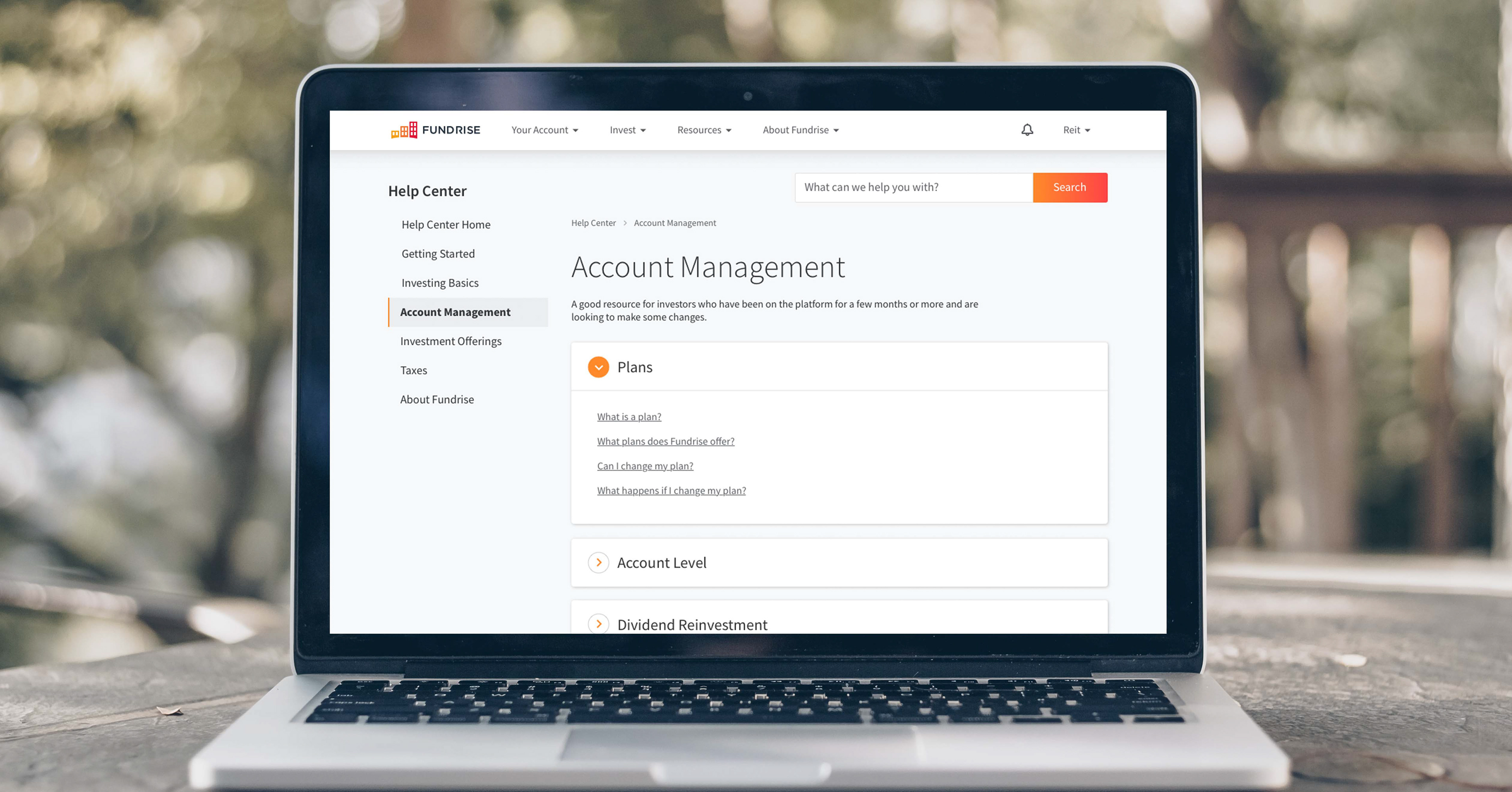
Visual design
Created designs following brand guidelines and leveraging existing UI components where relevant.


